Website Builder
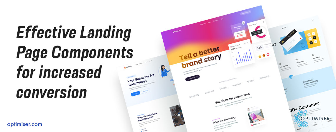
Effective Landing Page Components for increased conversion
The landing page is a standalone web page that is created specifically for marketing and advertising campaigns. It is the place where visitors land when they click on the link provided in the marketing materials. Reportedly, having a higher number of landing pages often results in more conversions. In fact, as per the report from HubSpot, companies have witnessed 55% conversions when they have 10-15 landing pages in total.
That being said, it is important to note that all landings should not be equal. The company’s website may have hundreds or thousands of landing pages, but if they are not optimised properly, they would not do any good for the business. The blog will cover important components of landing pages that can bring more conversions and maximise business revenue.
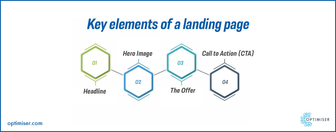
Key elements of a landing page
Although every landing page is different, however, these four basic elements remain the same:
1. Headline
2. Hero Image
3. The Offer
4. Call to Action
If you visit Optimiser Touchpoint Website Builder, you will get to see all these essential features in designing elements and notice that longer landing pages will have additional elements like:
- Features and Benefits
- Testimonials
- Your Bio
- Refund Policy or GuaranteeFrequently asked questions
All these sections are important for higher-priced or complicated offers. However, if you are promoting something for free, the original four elements will work. Businesses can always avoid A/B testing mistakes to convert better.
Components of high-converting landing page
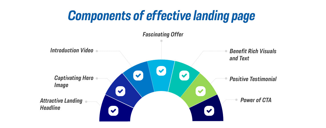
When you know the basic elements of a landing page, things become a little less complicated, but simply including them will not make your landing page great. Hence, we have dug deeper to find out important components of a landing page that have relatively higher conversion rates.
Attractive Headline
The headline of the page is the most important copy on the landing page. On average, 8 out of 10 visitors read headlines, and only two would read the rest of the page. So, it is crucial for you to make it count. Marketing managers need to ensure that the page headline aligns with the post, search listing, pop-up or advertisement that is sending visitors to the page. In case you have promised something in your advertisement, make sure that the headline makes it clear that it will be delivered.
Another important thing to note is that headlines should be clear and easy to understand. It is good to be smart but make sure that the vocabulary you use in headlines won’t make your readers scratch their heads. The primary objective of a headline is to allow readers to connect and urge them to read more.
Here are a few things that should be kept in mind, while writing headlines:
- How-to-headline: If there is some goal which your users look forward to achieve, then start your landing page headline with “how to” followed by their goal
- Pain point: Identify the problems your users face, and highlight that problem in the headline
- Value proposition: Rather than focusing on problems, highlight the benefits users will likely get if they take your offer
- Special offer: If you are advertising sales or offer, you can start your headline with that offer
Also Read: Importance of Progressive Web Apps for Websites
Captivating Hero Image
The text you put in the headline is not the only thing that will urge visitors to perform an action. Using good quality and relevant images is equally important to make your headline look powerful and effective. Reportedly, colourful visuals improve readership by 80%, so it is always good to have some imagery with text.
The hero image is the most important image that sits at the top of your landing page. Along with the headline, the hero image is responsible for convincing visitors to keep on reading.
Elements of a good hero image:
- High-resolution
- Vibrant/eye-catching
- Align with your headlines
Always remember that the hero image and headline work together. It is recommended to work on the headline first and then find a relevant image that shares a similar message.
Don’t Neglect Videos
Images are good, but if you are willing to take things one step ahead, then try using video. As per studies, putting video on the landing page can improve conversion by 86%. You don’t need to spend huge amounts to develop a fancy video, a normal video highlighting a summary of your offer would work. You can even put the walkthrough via presentation. Putting a video will give another option to visitors who aren’t big readers. There are people who might not want to read the entire page but will watch a short video to understand the offer.
Fascinating Offer
When it comes to the important components of an effective landing page, an offer is often overlooked. Maybe you have an impactful headline, good copy, and extraordinary visuals, but if your actual offer is not something your users are not interested in then your landing page will fail. The best way to find out what your users want is to listen to them, read their comments, review industry forums and consider previous emails by customers. Are there any consistent questions or issues they come up with? Note that, when you have something extraordinary to offer, it will automatically sell. It would become so much easier to write to copy when benefits and values are obvious. Hence, marketers should come up with something that the audience cannot refuse.
Benefit Rich Visuals and Text
People often want to know what’s in there for them. What are the problems you will solve; how are you going to improve their lives and why should they trust you with their personal and banking details? While discussing products, it is always easy to focus on features. Rather than simply talking about features, talk about their benefits. For example, if you offer photography services, rather than emphasising photo editing services, talk about how you can enhance your photographs through professional photo editing.
Positive Testimonials
Regardless of the number of evidence you may provide, readers will never trust you 100%. They understand that you are trying to sell to them and will take everything you say for granted. However, people often trust their peers. Around 88% of customers trust online reviews as much as personal recommendations. This is the reason why all successful landing pages have positive customer testimonials. If you have previous reviews from customers, make sure to put them on a landing page. Highlighting social likes, awards and client logos are some of the other ways to build users’ trust and provide social evidence.
Power of CTA
The last and most important thing to consider for an effective landing page is your Call to Action or CTA. It is enticing to use one page to promote several offers. However, that kills the purpose of the landing page, which is to convince users to perform certain actions. The average conversion rate of a landing page with one link is 13.5%, which drops to 11.9% when two or four and 10.5% when there are five or more CTA on a page. Hence, it is important to stick to one CTA that would keep visitors focused on your goal. Your CTA should start with command words like “Download”, “Buy”, or “Subscribe”, and tell users what they will get if they take action, for example, a free ebook, SEO course, digital marketing, or newsletter. You can also put words such as “Now” and “Today” to give a sense of urgency.
Use Optimiser Touchpoint to build your landing page
Optimiser Touchpoint is an integrated tool that comes with different features such as Website Builder, Forms, PWA, API, Asset Manager, Account Management and more. With Optimiser Touchpoint Website Builder, businesses can create stylish and mobile-friendly landing pages with complete customisation. It is more than a website builder that makes it easier for users to create desired pages without prior coding knowledge with easy drag and drop.
Summary
Now that you know the important components of an effective landing page for better conversion, it is time to put that knowledge in us. Use Optimiser Touchpoint to build high-converting landing pages without any coding knowledge. It further offers various other features making it easier for businesses to market and sell their products.

30 days free trial. No credit card required
 One powerful platform
 Simple to use
 Comprehensive

